Khaki Restaurant Content Production

The Khaki restaurant identity project was built around being grounded, tangible, and communal. We developed a complete brand identity system—from logo and visual language to service rules, core products, and delivery packaging—to ensure a consistent and tactile brand experience both in-restaurant and at home. The visual direction is based on khaki and red tones to convey warmth, earthiness, and appetite, while illustration, character design, and product design translate the restaurant’s cultural codes into functional, everyday elements.

customer logo

Logo Design

The logo was designed as a typographic mark with an accompanying icon. Khaki was chosen as the primary color to reflect authenticity and groundedness, with red used to highlight active elements. The typography carries a bold, handcrafted feel, and the icon version was created for small-scale usage, packaging, and digital applications.

“No Forks & Spoons” Policy

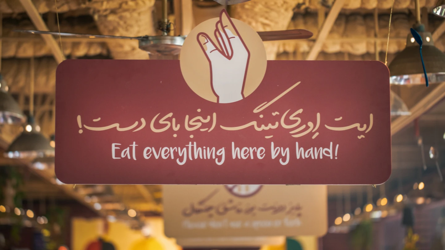
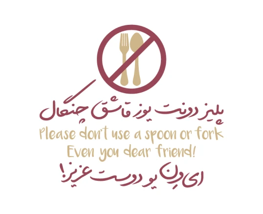
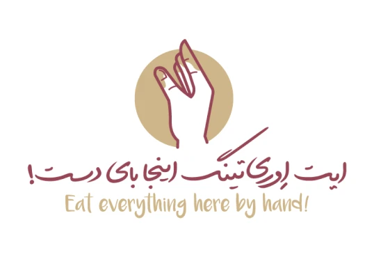
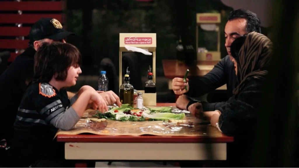
Khaki’s serving style is based on eating with hands. This approach is not just symbolic, but a clear brand stance on the dining experience—encouraging sharing, slowing down the act of eating, and emphasizing the tactile nature of food. To support this policy, we designed the service flow by removing cutlery, providing hand-washing solutions, single-use napkin kits, and placing visual guidance on tables and within delivery packaging.

Eating with Hands

To make hand-eating intuitive and accessible, we designed a set of friendly illustrations and visual templates. These guides were applied to table cards, placemats, and delivery inserts, ensuring the rules are communicated visually, clearly, and consistently across all touchpoints.

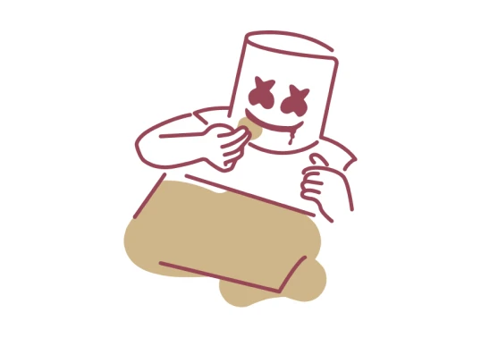
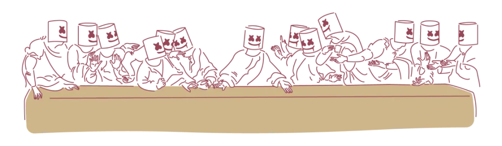
Marshmallow Mask

The Marshmallow Mask character, a favorite of the restaurant’s management, was first worn by service staff during food presentation. The idea gave the restaurant a distinctive, theatrical identity while keeping staff anonymous, and it sparked strong curiosity among guests inside the space.

The Anti-Cutlery Character

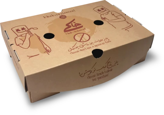
Building on the brand’s visual language, we created a dedicated character to carry the “no forks and spoons” message. Appearing across environmental graphics and packaging labels, the character reinforces the restaurant’s core rule with a playful, friendly tone that keeps the policy memorable rather than restrictive.

Integrated Packaging

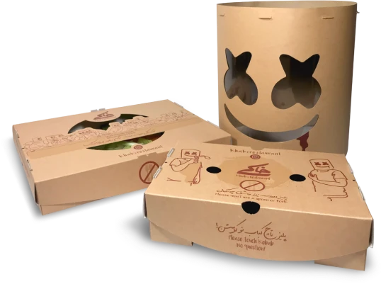
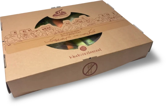
To carry the in-restaurant experience home, packaging was designed as one unified system rather than a set of separate boxes. Every piece keeps the brand’s visual language intact while being engineered for low-cost production and simple assembly, keeping delivery logistics fast and uncomplicated.

Khaki Delivery

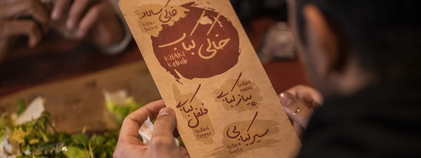
Following strong in-restaurant demand, Khaki Delivery was launched. The flagship item, Khaki Kebab, includes a signature grilled meat kebab served with fresh bread, roasted tomato and garlic, alongside bamieh and a tea bag—all packed in an organized package designed to maintain temperature and food arrangement during delivery.

Khaki Salad

Khaki Salad was developed as a complementary item to balance the grilled main course with freshness. Ingredients and layout were selected to withstand delivery time, while the dressing is provided separately to preserve texture and freshness at the time of serving. This item quickly became a popular addition to the package.

DIY Paper Mask & Social Activation

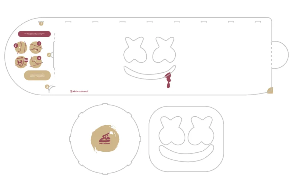
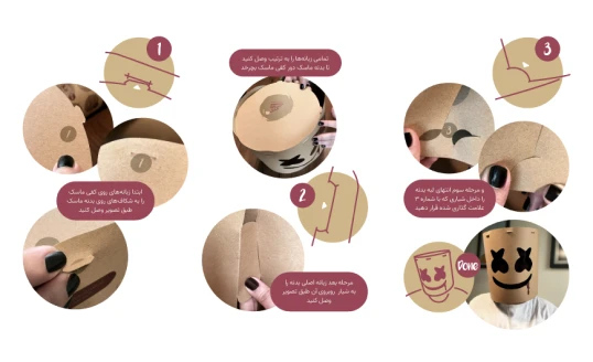
To keep delivery customers engaged, a paper version of the Marshmallow Mask was included in everاy package as a die-cut sheet. Its simple assembly encourages customers to build the mask at home, photograph themselves in it, and share the moment on social media—turning a small packaging insert into a genuine social activation tool.

Snapp Food

2010

thanks for watching
Share

Related Projects