We redesigned the Tahdeeg logo by enhancing the color palette and refining the structure while preserving its original form. The result was a refreshed, balanced identity that remains loyal to the brand's roots.
Food Introduction
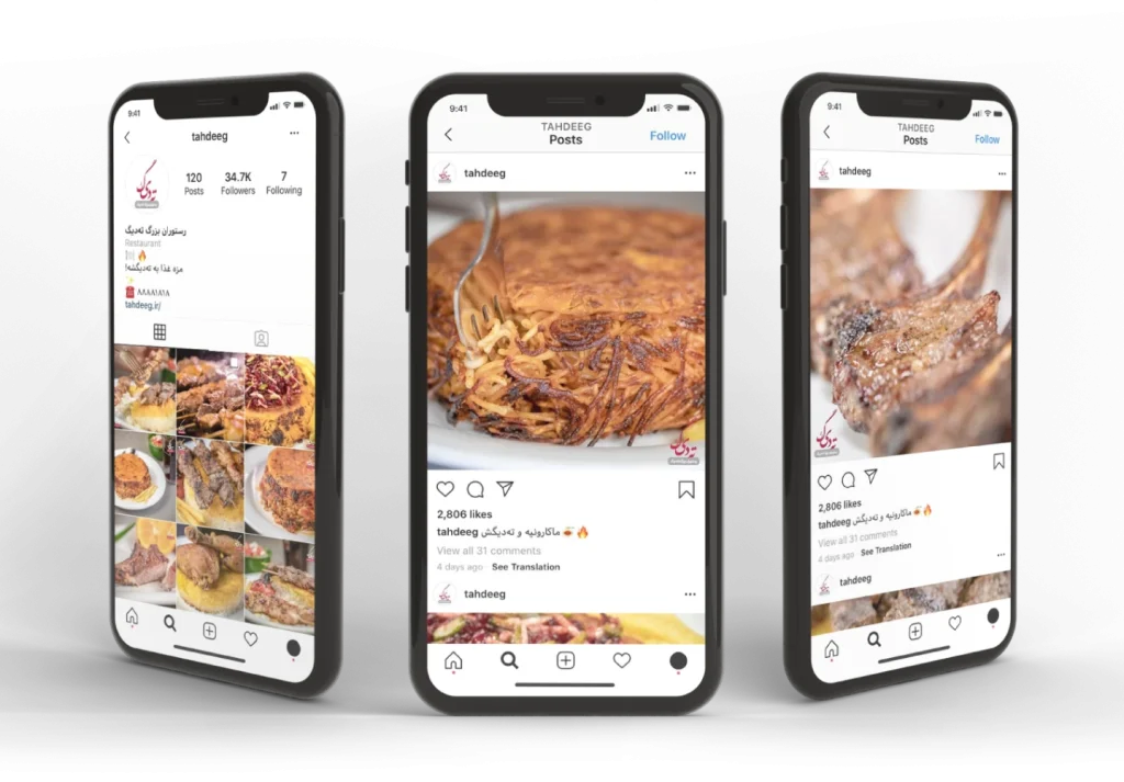
We developed a visual and content direction that emphasizes the cultural and emotional appeal of Tahdeeg (the crispy rice layer) as both a name and a beloved Iranian dish. The storytelling was adapted to fit digital audiences and platforms.
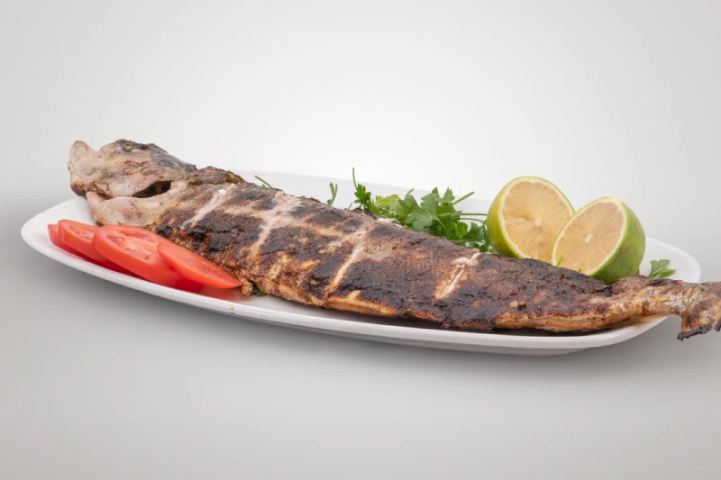
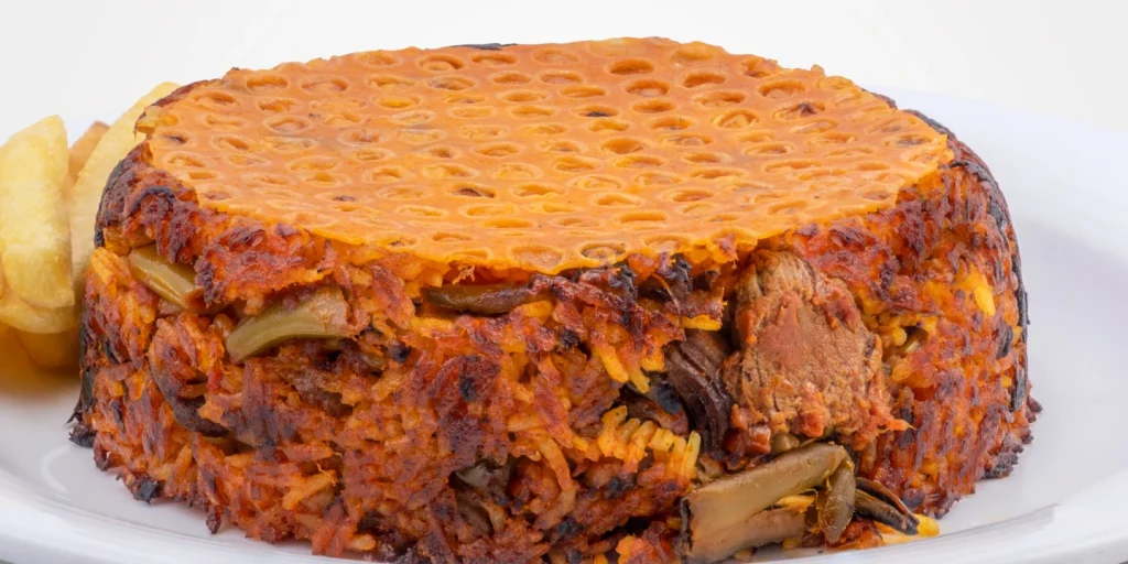
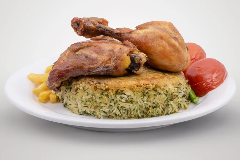
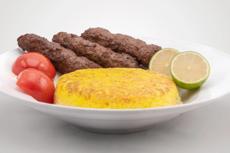
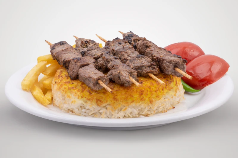
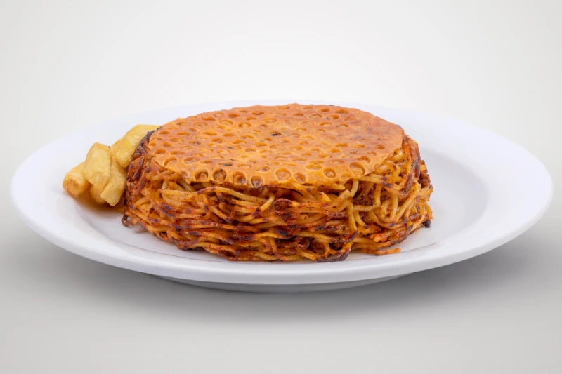
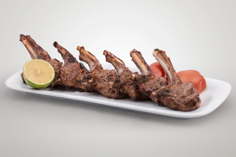
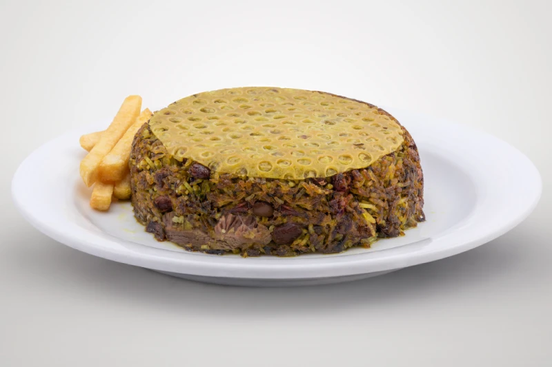
Food Photography
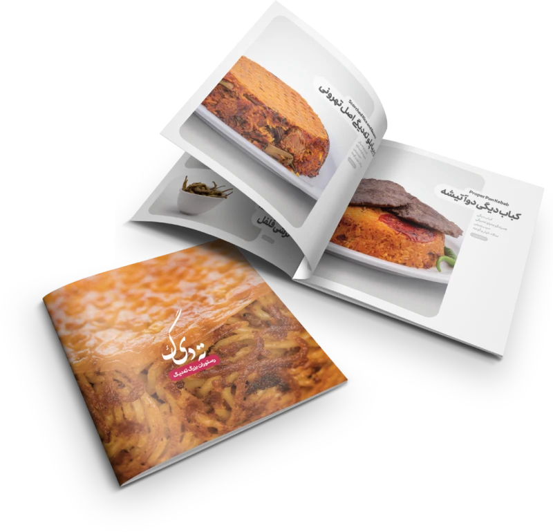
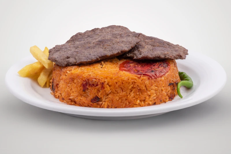
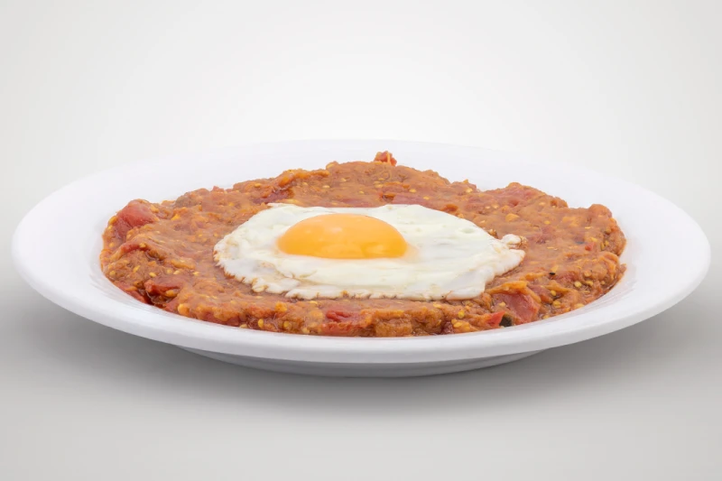
Using Focus Stack photography techniques, we captured Tahdeeg's dishes in high detail and with excellent visual focus. These photos were used across the restaurant’s menu and online platforms to boost appetite appeal and brand quality.
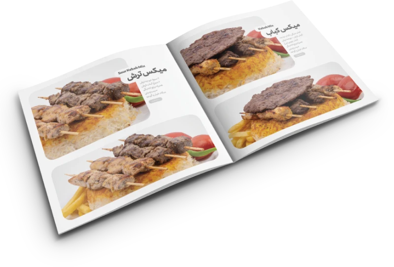
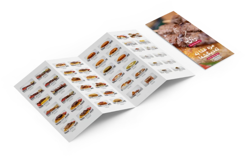
Delivery Menu Design
Considering the fast-paced and order-oriented nature of delivery menus, the new design for Tahdeeg restaurant's delivery menu was created with a focus on simplicity, high readability, and visual appeal. Each food category was marked with custom icons, and food images were arranged to make the selection process easier and more enjoyable for customers.
Food Category Icons
A custom set of icons was designed to distinguish between different food types on the menu — from stews to grills — making the user journey more intuitive and visually cohesive.